Showing posts with label Poster. Show all posts

Tuesday, 8 March 2016

Using Photoshop

For our poster and some elements of our website we had to use Photoshop. For A2 it is a new, unfamiliar software so we began by experimenting with it.


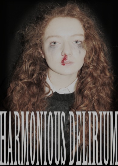
In this photo we wanted to edit the colouring to make her hair more red and her skin more pale- to represent the power her addiction has over her. The motif of red colouring is used throughout our teaser trailer to represent her addiction and the danger it enforces on to her.

We edited different layers of our poster in order to change the colour of the photo to black and white. By using the lasso tool, we were able to select the areas in which we wanted to bring out the colour- the blood from her nose and her hair. Both are red and fit in with the motif of bright red lighting that is exhibited in our teaser trailer. However we decided that we didn't want to use this style for our poster, as it gives the photograph an animated effect, and we believed it looked rather unprofessional. The black and white element doesn't really fit with the tone of our trailer and from analysing pre-existing movie posters we understood that the more the poster reflects the trailer, the more effective it is.


To create our Poster, we layered photos of the protagonist on to a black background. By editing the opacity of the photo layers, we were able to create a photograph that depicts two of her- one that is looking sideways, creating suspicion while the other looks straight ahead. We matched the photos up so that they shared an eye, representing how intertwined the protagonist and her addiction are. Throughout the Teaser Trailer she is presented as two different people, with and without the drug and these are depicted on the poster. Regarding typography, Photoshop only allowed fonts to be up to a certain size, so we had to select a font in Word, and apply this to the poster afterwards. Luckily Photoshop allowed us to remove the backgrounds of the typography which was necessary when adding the typography. We also used this tool for the title on our website.

Our final poster

At first, we weren't sure which image to use for our poster. We had a couple to choose from but neither of them were exactly what we wanted to use on a poster to represent our film.
We attempted to make a poster with this image- to see what it would look like after we edited it and added typography. However it didn't have the right tone we wanted to portray through our poster, and the theme of distortion wasn't present.
We next changed the image to one with two photos overlapping-something we do with our shots in our trailer. We matched up Bethan's eyes, which worked quite well. 
We decided that we also needed to change the typography- it was difficult to read and we didn't think it gave the poster the right tone.

This is our final poster.

The genre of our film is psychological thriller, and this is why we used two overlapping images. The photo is the key focus of the poster which is why our typography is minimalistic. Bethan is two people- before and after she takes the drug. The first image depicts her looking sideways- looking for a way out of her addiction. However, the more prominent image is the face of the drug-addict, suggesting no matter how hard the protagonist tries to beat her addiction- she can't win.  While the left image looks calm, and natural- the right face has a nosebleed to show her physical deterioration and mascara smudged under her eyes, to show her emotional deterioration.

The photo is quite dark- with a black background and a reddish/brown tint to the protagonist.  This is why we decided to make our typography white- so it is easily visible and catches the attention of the audience. The font is simplistic to contrast the complexity of the over lapping images, and what they signify. The title separates the tagline, making the words 'Harmonious Delirium' the centre of the audience's attention regarding typography. Although the quotes under the stars are small- the five star ratings are easy to see which will draw the attention of the audience anyway. 

Following the conventions of a typical film poster we have included the credits at the bottom of the poster. These are hard to read but the point of a poster isn't necessarily to promote the actors, director and producers. 


Monday, 8 February 2016

Poster Idea One

For our movie poster, our main inspiration is the poster from Before I Go To Sleep.


As our film centres around one character in particular, not three, we are going to have three images of Bethan in a similar format. The left one will be of her before she has a drug addiction, the middle will be from the party, where she tries the drug for the first time and the last will show the protagonist as her health is deteriorating. 

The centre image will be this: 
It fits in with the theme of our website and trailer as the predominant colour is red. Bethan's hair, makeup and clothing is minimal to allow the red light to be the focus; it is eye catching enough on its own. She is staring right into the camera with a dazed/confused look on her face. This is half way between content and devastated which is what the other two photographs depict.