
 At first, we weren't sure which image to use for our poster. We had a couple to choose from but neither of them were exactly what we wanted to use on a poster to represent our film.
We attempted to make a poster with this image- to see what it would look like after we edited it and added typography. However it didn't have the right tone we wanted to portray through our poster, and the theme of distortion wasn't present.
We next changed the image to one with two photos overlapping-something we do with our shots in our trailer. We matched up Bethan's eyes, which worked quite well.

We decided that we also needed to change the typography- it was difficult to read and we didn't think it gave the poster the right tone.

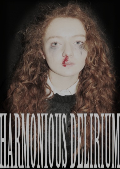
This is our final poster.
The genre of our film is psychological thriller, and this is why we used two overlapping images. The photo is the key focus of the poster which is why our typography is minimalistic. Bethan is two people- before and after she takes the drug. The first image depicts her looking sideways- looking for a way out of her addiction. However, the more prominent image is the face of the drug-addict, suggesting no matter how hard the protagonist tries to beat her addiction- she can't win. While the left image looks calm, and natural- the right face has a nosebleed to show her physical deterioration and mascara smudged under her eyes, to show her emotional deterioration.
The photo is quite dark- with a black background and a reddish/brown tint to the protagonist. This is why we decided to make our typography white- so it is easily visible and catches the attention of the audience. The font is simplistic to contrast the complexity of the over lapping images, and what they signify. The title separates the tagline, making the words 'Harmonious Delirium' the centre of the audience's attention regarding typography. Although the quotes under the stars are small- the five star ratings are easy to see which will draw the attention of the audience anyway.
Following the conventions of a typical film poster we have included the credits at the bottom of the poster. These are hard to read but the point of a poster isn't necessarily to promote the actors, director and producers.
No comments:
Post a Comment