In what ways does your media product use, develop, or challenge forms and conventions of real media products?
Thursday 28 April 2016
Evaluation: Question 2
How effective is the combination of your main product and ancillary texts?

 Imagery:
 For our Promotional Package, we kept a
direct link through the use of imagery. Our trailer is focused around a teenage
girl whose life is essentially torn apart due to her taking a “gateway drug”,
which leads to both substance and alcohol abuse as well the impact it has on
her life, and her mental health. To make this clear to the audience, the visual imagery used on our Poster, and website both also focus heavily on this. We decided to only have the protagonist on
our poster, as we wanted to convey the importance of her character within the
film, as well as the negative effects the drug has had, as it shows how the
character is two different people, before and after she takes the drug. The
imagery on our website is also consistent to the visual imagery on the poster, and the
imagery used in our Teaser Trailer. We did this by using different shots from
our Teaser Trailer, and putting them as the background for our website.
For our Promotional Package, we kept a
direct link through the use of imagery. Our trailer is focused around a teenage
girl whose life is essentially torn apart due to her taking a “gateway drug”,
which leads to both substance and alcohol abuse as well the impact it has on
her life, and her mental health. To make this clear to the audience, the visual imagery used on our Poster, and website both also focus heavily on this. We decided to only have the protagonist on
our poster, as we wanted to convey the importance of her character within the
film, as well as the negative effects the drug has had, as it shows how the
character is two different people, before and after she takes the drug. The
imagery on our website is also consistent to the visual imagery on the poster, and the
imagery used in our Teaser Trailer. We did this by using different shots from
our Teaser Trailer, and putting them as the background for our website.
We also conformed to the general theme of our trailer, as a lot of the visual imagery used on our Website, shows the different drugs that the protagonist has taken. An example being the background image of the Protagonist smoking. This image was used to show how our protagonist has been influenced by the gateway drug, and how she has progressed into using different drugs as well. Another example of this is the image of the syringe.
Using similar imagery throughout our Promotional Package is effective as it makes the genre and theme of our film very clear for the audience who want to view it. It can also be considered effective as it ties together the Promotional Package through visual branding, allowing the audience to see the similarities between all three texts which makes them view all these texts as a single Promotional Package.
Themes:
The main theme for our Teaser Trailer is the negative effects of drugs. We were able to convey this theme through all our Media texts. In our poster we conveyed this theme by the use of layering the protagonist, as it displays to the audience how she was before, and after taking the drug, as it can suggest her changes in personality, due to the lighting used, as well as the use of blood coming through her nose in the right hand image. The use of the blood in the right hand image

We were able to convey the theme of drugs in our website as well, by using different types of drugs in the background image, some which we took from our Teaser Trailer.
It was important that throughout our Teaser
Trailer, poster and website we successfully kept a direct theme running to
conform to our film genre, which was a Psychological Thriller, as well as to
relate to our target audience, which were Young Adults over the age of 18.


 For our Promotional Package, we kept a
direct link through the use of imagery. Our trailer is focused around a teenage
girl whose life is essentially torn apart due to her taking a “gateway drug”,
which leads to both substance and alcohol abuse as well the impact it has on
her life, and her mental health. To make this clear to the audience, the visual imagery used on our Poster, and website both also focus heavily on this. We decided to only have the protagonist on
our poster, as we wanted to convey the importance of her character within the
film, as well as the negative effects the drug has had, as it shows how the
character is two different people, before and after she takes the drug. The
imagery on our website is also consistent to the visual imagery on the poster, and the
imagery used in our Teaser Trailer. We did this by using different shots from
our Teaser Trailer, and putting them as the background for our website.
For our Promotional Package, we kept a
direct link through the use of imagery. Our trailer is focused around a teenage
girl whose life is essentially torn apart due to her taking a “gateway drug”,
which leads to both substance and alcohol abuse as well the impact it has on
her life, and her mental health. To make this clear to the audience, the visual imagery used on our Poster, and website both also focus heavily on this. We decided to only have the protagonist on
our poster, as we wanted to convey the importance of her character within the
film, as well as the negative effects the drug has had, as it shows how the
character is two different people, before and after she takes the drug. The
imagery on our website is also consistent to the visual imagery on the poster, and the
imagery used in our Teaser Trailer. We did this by using different shots from
our Teaser Trailer, and putting them as the background for our website.We also conformed to the general theme of our trailer, as a lot of the visual imagery used on our Website, shows the different drugs that the protagonist has taken. An example being the background image of the Protagonist smoking. This image was used to show how our protagonist has been influenced by the gateway drug, and how she has progressed into using different drugs as well. Another example of this is the image of the syringe.
Using similar imagery throughout our Promotional Package is effective as it makes the genre and theme of our film very clear for the audience who want to view it. It can also be considered effective as it ties together the Promotional Package through visual branding, allowing the audience to see the similarities between all three texts which makes them view all these texts as a single Promotional Package.
Colour Scheme and Typography:
The colour scheme for our Teaser Trailer, Poster
and Website is somewhat consistent. The
typography in all three texts is white, specifically the colour of the
typography for the titles shown on the Website and the reviews shown in the Teaser Trailer. We
decided to keep the same colour scheme and font for both the texts because we
felt as though the white colour would stand out to the audience as the
typography was on a dark coloured background. We used a mix of dark colours such as the
black background on our poster, and the colour of red, seen on our website
background with some of the background pictures, and our Teaser Trailer.
We used these two colours in all of our texts to convey to the audience the dark nature of the film, as the use of the red colouring connotes danger, as well as showing the mental instability of the protagonist, as the use of bright red lighting could potentially connote disorientation. The use of the darker colours can also connote a sense of danger, as well as a sense of evil, as the villains in films tend to usually wear very dark clothing.
On top of this, the use of the text being in white in all three texts, and the background of the poster being dark, as well as the background in the Teaser Trailer being black when the title appears, can be used to show the binary opposition of the character before and after she takes the drug, as black and white is usually used together to show good vs evil. The style of the typography, is typically masculine as it is bold and not cursive. We felt as though this would subvert the audiences expectations as we subverted the general convention of the Psychological Thriller genre as the protagonist is typically a male, whereas we used a female. Using the same colour scheme throughout the three texts is extremely effective as it gives the audience a clear idea of the genre of the film.
Themes:
The main theme for our Teaser Trailer is the negative effects of drugs. We were able to convey this theme through all our Media texts. In our poster we conveyed this theme by the use of layering the protagonist, as it displays to the audience how she was before, and after taking the drug, as it can suggest her changes in personality, due to the lighting used, as well as the use of blood coming through her nose in the right hand image. The use of the blood in the right hand image

We were able to convey the theme of drugs in our website as well, by using different types of drugs in the background image, some which we took from our Teaser Trailer.
Evaluation: Question 3
What have you learned from your audience feedback?


 For question one,we got a brief idea of what our audience expected from a Psychological Thriller, and from this we could see that the majority of responses expected to see drugs, dark lighting and red lighting. We thought it was very interesting too see how our audience saw the significance of lighting for Psychological Thrillers, this could be because of the conventions of most well known Psychological Thrillers, such as Requiem for a Dream, as they often portray the colours red and black, and deal with psychological issues such as drugs. Additionally, this could be because the audience picks up on the dark connotations of darkness and red imagery - therefore as from this survey we became immediately aware of the audience's belief of the importance of lighting - this was a very signifiant and prominent aspect of our trailer.
 Therefore, in order to comply with these, we used low key lighting throughout the more drug-fuelled shots, and used a prominent red colouring for the drug taking scene. This colour use fulfilled the audience's expectations of what a Psychological Thriller should appear like. We had the theme of drugs throughout, with repeated extreme close up shots of various drugs, and a suspenseful drug taking scene.


 This question was asked in order for us to be able to narrow down which colours we focused on within our trailer. The audience's belief of the significance of lighting, and the prominent connotations of red and back is again very evident in this question. This could be because of the common use of this low-key lighting and red and black colour imagery, in modern Psychological Thrillers that our primary audience will be used to watching, such as Se7en, The Machinist and The Silence of the Lambs

Both black and red follow the conventions of a Psychological Thriller, and they obtain negative connotations, such as evil and blood, which are what we were aiming to convey. This is likely to be why the majority of the audience chose these answers.


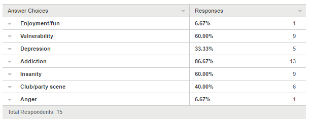
For this we wanted to see what the audience expected to see regarding a drug addiction, and whether they would expect to see it in a more negative or positive light. The majority of responses were what we had anticipated they audience would want to see, which was they would expect to see the themes of addiction, vulnerability and insanity. We can suggest that the audience expects to see this due to the effects of drugs, and how they are often portrayed to take a negative toll on the user's life. Additionally, we can consider how drugs are such a dominant aspect modern society, especially within youth culture - therefore these negative themes, such as vulnerability, depression and addiction, are the most common answers as this is what our audience is used to being surrounded by.
We used the mise en scene, lighting, editing and camera work in order to depict these themes.
 We used extreme close up shots of various drugs in order to convey her addiction, as the trailer went on we conveyed stronger and more dangerous drugs, such as the syringe, in order to convey her
progressive addiction.
 We illustrate the theme of vulnerability through her inability to stop her addiction, she has lost control to it. This is depicted through shots of the physical effects that the drugs have on her, such as nose bleeds, and her spitting out blood. We also convey her lack of control through shots of her screaming and running, to highlight her unhappiness and vulnerability.


This question gave us more of an idea of the specific ways in which an audience expects to see a drug addiction presented on screen. The most popular responses were for there to be multiple shots of drugs, and for there to be a fast pace. This was an interesting response as it gave us an insight into what our audience perceives to be important aspects of a drug addiction. Multiple drug shots indicates that an audience sees drug addictions as something extreme, where the user is completely submerged in a drug-fuelled experience and life. This suggests that the audience views drug addiction in a negative light, as it puts forward the idea that they see it as dangerous.
Additionally, the popularity of the answer 'fast pace' illustrates that they see the overwhelming effect of the drugs, which causes distortion and disruption within a normal life. These opinions could again be because drugs have become so common within modern society, to the extent where our audience is very aware of the danger and disruption of this.

Initial Audience Feedback
After developing a few initial ideas for the trailer we created a survey that was answered by 16-18 year olds, and was about what they as an audience believed would be more effective for our trailer. We did this to see what this audience would expect from a Psychological Trailer, and what they would want to see in one. Therefore, after collecting their answers we could respond accordingly within our media piece.


 For question one,we got a brief idea of what our audience expected from a Psychological Thriller, and from this we could see that the majority of responses expected to see drugs, dark lighting and red lighting. We thought it was very interesting too see how our audience saw the significance of lighting for Psychological Thrillers, this could be because of the conventions of most well known Psychological Thrillers, such as Requiem for a Dream, as they often portray the colours red and black, and deal with psychological issues such as drugs. Additionally, this could be because the audience picks up on the dark connotations of darkness and red imagery - therefore as from this survey we became immediately aware of the audience's belief of the importance of lighting - this was a very signifiant and prominent aspect of our trailer.
 Therefore, in order to comply with these, we used low key lighting throughout the more drug-fuelled shots, and used a prominent red colouring for the drug taking scene. This colour use fulfilled the audience's expectations of what a Psychological Thriller should appear like. We had the theme of drugs throughout, with repeated extreme close up shots of various drugs, and a suspenseful drug taking scene.
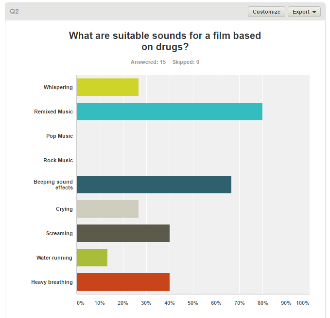

For this question we wanted to see what sounds the audience thought was most relevant for a Psychological Thriller, the most popular answers were 'remixed music' and 'beeping sound effects'. We found this response interesting, and thought the popularity of the answer could be because we were asking a younger audience, and as this genre of music is more lively and youthful it is more relatable to a younger audience as it is what they are used to being exposed to. It can be suggested that Psychological Thrillers typically have an older, more adult-based audience, so by using a very current remixed songs, we appealed more to our target demographic. We can also suggest that with modern drug-fuelled media, such as Pulp Fiction, Skins, Breaking Bad, and Trainspotting, the drugs are depicted in a positive way, which is mirrored by the party/club scenes and the upbeat, positive/lively music used - therefore this is what our target audience is accustomed to and associated drug scenes with.
This response could also be because the remix of music can add to the fast pace of the trailer, and can also create a sense of distortion that the drugs create.
The monotony of the beeping sound is effective as it can contrast the fast paced variety of shots. We decided to start the trailer with the sound effect of an alarm clock, in order to convey they initial normality of the protagonist's life. This then increased in speed, and began to resemble a heart monitor, this symbolised the change in her life as she began experimentation with drugs. The switch from normality resembles the disruption in her life.
For the drug fuelled shots we created a remix of several popular songs, these mirrored the on screen action, as we edited the shots so they were synchronous with the music. Additionally, the mash up of songs added to the distortion that was created through post-production editing, such as layering.


 This question was asked in order for us to be able to narrow down which colours we focused on within our trailer. The audience's belief of the significance of lighting, and the prominent connotations of red and back is again very evident in this question. This could be because of the common use of this low-key lighting and red and black colour imagery, in modern Psychological Thrillers that our primary audience will be used to watching, such as Se7en, The Machinist and The Silence of the Lambs
Both black and red follow the conventions of a Psychological Thriller, and they obtain negative connotations, such as evil and blood, which are what we were aiming to convey. This is likely to be why the majority of the audience chose these answers.
We made red our most prominent colour used in order to depict the real shift in the protagonist's life. The red symbolised danger, fear, corruption and blood - which are all themes conveyed within our trailer. We use the red lighting very explicitly in the drug taking scene, and then it is most subtly displayed throughout the rest of the trailer (eg blood).


For this we wanted to see what the audience expected to see regarding a drug addiction, and whether they would expect to see it in a more negative or positive light. The majority of responses were what we had anticipated they audience would want to see, which was they would expect to see the themes of addiction, vulnerability and insanity. We can suggest that the audience expects to see this due to the effects of drugs, and how they are often portrayed to take a negative toll on the user's life. Additionally, we can consider how drugs are such a dominant aspect modern society, especially within youth culture - therefore these negative themes, such as vulnerability, depression and addiction, are the most common answers as this is what our audience is used to being surrounded by.
We used the mise en scene, lighting, editing and camera work in order to depict these themes.

progressive addiction.
 We illustrate the theme of vulnerability through her inability to stop her addiction, she has lost control to it. This is depicted through shots of the physical effects that the drugs have on her, such as nose bleeds, and her spitting out blood. We also convey her lack of control through shots of her screaming and running, to highlight her unhappiness and vulnerability.
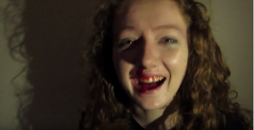
We depicted insanity by breaking the fourth wall and having our protagonist laughing into the camera in spite of the pain and suffering she is experiencing. This presents her psychological disturbance, and follows the conventions of a Psychological Thriller.


This question gave us more of an idea of the specific ways in which an audience expects to see a drug addiction presented on screen. The most popular responses were for there to be multiple shots of drugs, and for there to be a fast pace. This was an interesting response as it gave us an insight into what our audience perceives to be important aspects of a drug addiction. Multiple drug shots indicates that an audience sees drug addictions as something extreme, where the user is completely submerged in a drug-fuelled experience and life. This suggests that the audience views drug addiction in a negative light, as it puts forward the idea that they see it as dangerous.
Additionally, the popularity of the answer 'fast pace' illustrates that they see the overwhelming effect of the drugs, which causes distortion and disruption within a normal life. These opinions could again be because drugs have become so common within modern society, to the extent where our audience is very aware of the danger and disruption of this.

We used various extreme close up shots of numerous different drugs to display her addiction. We used an overwhelming amount of tablets, and covered the entirety of the camera lens, this suggests how inescapable the drugs are to the character, and how they have become the most pivotal aspect of her life.
 Additionally, we scattered a variety of pills over a counter top, this demonstrated the sheer amount of them, and by being thrown carelessly around it mirrors the protagonist's lack of control.
Throughout the trailer we utilise a very fast pace, keeping the shots in time with the non-diegetic music, this represents the chaos in her life, and suggests that everything is all happening so quickly she has no time to process it all, or do anything to change it.
We also used other, less popular, answers to this question to convey her addiction, such as breaking the fourth wall, screaming shots, fish eye effect and blood, as we felt these all conveyed a psychological breakdown, and depicted her descent into insanity and addiction. Also, some of these shots, such as the fish eye effect used during the party scene add to the sense of distortion which is caused by the effects of drugs. We also created this effect though post-production editing, such as layering
First Draft Feedback
After completing our first draft, we received detailed audience feedback from a focus group of 17-20 year olds on how to improve the piece.
It was suggested that the beginning section of the trailer did not effectively convey the Psychological Thriller genre, due to the slow pace, continuity, and high-key lighting.
The opening montage was seen as too similar to a film opening, rather than a teaser trailer, and conveyed aspects of Social Realism, as opposed to Psychological Thriller. Because of this we decided to remove the opening montage, in order to focus more on her drug addiction, and added in drug shots, such as an extreme close up of a syringe, the protagonist drinking alcohol, and pills spilling onto a counter.
After listening to the feedback we decided to make the trailer more effective we needed to further display the protagonist's descent into addiction and insanity. In order to depict her powerlessness and breakdown, we needed to add more drug fuelled shots, and more shots of her breaking down into madness, such as multiple drug shots.
For the drug taking scene it was brought to our attention that there was not enough variation in shots, there were too many repeated shots with red lighting. Therefore, we subsequently removed several of the shots that we had repeated of her dancing, and added in more shots of her breakdown, such as the protagonist breaking the fourth wall and laughing into the camera.
Additionally, in our draft it appeared that the protagonist's mental instability occurred over the process of one night after the party, however we had intended to portray a breakdown over a longer period of time. In order to change this we added more locations, such as the living room, and also styled her with a multitude of costumes. This also more closely followed the conventions of a teaser trailer, which display events that take place over a longer period of time.
One of the main issues that came to our attention was the main drug used during the initial drug taking scene. Feedback from the focus group told us that the drug appeared too unrealistic and unintimidating, therefore to really emphasise the dangers of the drug use we changed this to multiple drugs all falling onto the camera, we did this to highlight how the increase in drug use, within society, as visually they are everywhere, covering the screen completely.
We were told that a way we could improve our trailer would be to add more creative editing, and camera angles. We achieved this by creating unique shots with the GoPro, this included experimenting with taping the camera to the bottom of a glass bottle, we edited this into a match on action shot of our protagonist drinking alcohol. Additionally, we put the GoPro at the bottom of a full bath and created an ambiguous shot of the protagonist screaming underwater. This follows the conventions of a Psychological Thriller as it adds a sense of mystery. We also expressed creativity through the trailer with graphic matching at the start, before she attends the party. In these shots she is facing away from the camera, getting ready and walking, the repetitiveness of the shots mirror the normality of her life before it is disrupted by drugs.
To make the pace of the trailer more effective we most shots, making them shorter, and added a variety of very fast paced new shots. We edited this in a way so it was in time with the non-diegetic music, so at each new beat there was a new shot. This new faster pace was not only parallel to the music, but also the narrative as it created tension and created a sense of lack of control, as it goes so fast the audience is almost unable to focus on the whole thing - similar to how the drug addiction is affecting the protagonist.
Final Piece Feedback
'The transition between the beginning and the end is profound'
'The lighting really conveys the theme across well to the audience'
'Captivating'
'The use of a domestic location really contrasts the theme of drugs'
'Visually stunning'
'The shots of drugs emphasise that she is in a narcotics fuelled world'
Audience feedback is vital when creating a product, as the response is coming from the target demographic, and they are lucrative, therefore their opinion is essential.
Evaluation: Question 4
Question 4: How did you use media technologies in the construction and research, planning and evaluation stages?
Monday 25 April 2016
Deconstruction of Martha Marcy May Marlene Website


The user is able to click on certain parts of the image, which leads them to another picture, which was likely used in the film. The image is shown to be slightly distorted, conforming to the Psychological Thriller genre, as the audience is not given all the information of the plot. At the top of the page, the website has a sidebar, linking to two social media websites, Facebook, and Twitter, therefore appealing to a wide range of audiences.

Sunday 24 April 2016
Changes to our Teaser Trailer-The Montage
After finishing the first draft of our Teaser Trailer, the feedback we received said that our beginning montage was too long, providing an unclear narrative as it seemed more like a film opening rather than a Teaser Trailer. It would have therefore confused the audience, as they may not have been able to clearly identify the genre of out piece.

 We therefore decided to cut down the montage at the beginning of our trailer. We only used three scenes, all with the protagonist with her back to the camera. The feedback from our changed montage scene was more positive due to the shorter length, and the fact that it provided a clearer narrative for the audience, as the transition to the party scene in our trailer works better.
To make this transition work, along with cutting down the beginning montage, we also added the non-diegetic sound of an alarm clock, which increases in volume and tempo to mirror a heart monitor, which provides a clear transition to the next scene, which is the POV of the protagonist the party.

Subscribe to:
Posts (Atom)