Showing posts with label Lauren. Show all posts

Tuesday, 19 April 2016

Reconsidered Certification

We have decided to alter the certification of our Teaser Trailer to an 18, due to the mature themes and dark nature of the trailer. After doing research, we discovered that the theme of drugs is more relevant to 18-21 year olds and is a very serious issue. Because the audience is intended to be active, it is up to them to think for themselves when they view the film and we felt as though 15 year olds weren't the right target audience.

Our Trailer does not promote nor encourage drug use, although at the negative effects are not explicit until the second half of the trailer- which may mean it is not suitable for under 18s. Although our teaser trailer has no strong language, it is likely our film would as it is a hybrid between a Social Realism and a Psychological Thriller and it is a convention often adhered to in both genres. Our teaser trailer is comprised of a multitude of close ups of drugs, and overall, drugs are explicit throughout.

Monday, 11 April 2016

Deconstruction of Gone Girl Teaser Trailer

The first shot of this trailer is a tracking shot, first showing the audience the 'Missing' poster and then moving towards the crowd of people holding candles. The lighting is low-key and the diegetic sound of crickets in the night creates an eerie ambience. This is contrasted by the non-diegetic contrapuntal piano music which sounds upbeat and romantic. There is a sound bridge to the next shot- a midshot of Nick speaking into the microphone, with Amy's parents to the right of him, and a poster of Amy framed in the background to his left. Everyone believes Nick is the only thing standing between Amy being reunited with her parents and this framing further suggests that. It is a low angle shot, and possibly a point-of-view shot, as Nick is standing on a stage, above the crowd. This presents him as powerful and dominant. Nick is also presented as powerful in the next shot, in which Amy's head is against his chest and she looks up at him. His hand is stroking her head and she is in a vulnerable position. The non-diegetic love song continues and the lyrics depict everything the audience is lured into believing Amy is innocent.

Three shots of Nick Dunne are used, separated by two contrasting shots- one of them kissing and then of the first sign that something is wrong when Amy disappears. The shots of Nick zoom in each time, closer to his face as he realises for the first time that something bad has happened. Nick is framed alone; the long shot leaves him in the middle of the screen, surrounded by the interiors of the house, the cool tones of the shots on his own, contrast the warm yellow tones of the shot of the couple. Their lives have changed so drastically from then to now, and this is evident in the lighting. The shots of Nick have high-key natural lighting suggesting that the truth will be revealed while the kissing shot is low key, and only their silhouettes are visible clearly. The eye level midshot presents a balance in the relationship that is no longer there.

The last shot of Nick in this sequence, is a low angle close up, presenting him as powerful and is one way in which the audience are made unsure of what happened to Amy. His face is lit naturally from the windows on the left but the right side of his face is left dark, conveying a duplicitous nature and a hidden truth, once again handing the audience false clues as to what has happened.

Throughout the trailer, there is a variation of lighting- often a high-key lit shot will be followed by a lowly-lit shot. Other shots incorporate both light and darkness- such as the shot of Nick pulling down the blinds. His face is in the background of the shot and is dark and appears sinister as he shuts the light out. The blind is in the foreground- and is brightly lit by natural light. It is also white which furthers the contrast to Nick's shadowed face in his dark home.

Fast paced montage editing is a convention of teaser trailers and the shots are often cut quickly to prevent giving too much away to the audience. The screen goes black just as Nick grabs Amy, and the audience are more likely to watch the film to find out what happens next. To add drama, this is where the music gets faster and a fast paced drum beat comes in. This is supposed to be the most romantic part of the song, but when paired with the contrasting abusive shots, it is twisted and becomes disturbing.

The straight cut editing gets faster as the teaser trailer progresses until the last shot of Amy's body in the water after being drowned. This creates tension and intrigue, which is the ambience a Psychological Thriller wants to leave with the audience. The water is dark and appears murky- which contrasts Rosamund Pike's fair skin and blonde hair. She is often labelled as an English Rose. The fade to black after the shot adds more mystery as Nick Dunne's voiceover pleads innocence while the audience can see her body on screen.

The trailer finishes on the line "I did not kill my wife. I am not a murderer," which reiterates the main plot, and leaves the audience to decide whether they believe him or not. The last shot matches the poster and the website- shots similar to this are used to connect the trailer with its ancillary products, and help to promote the film to a larger extent.


Monday, 28 March 2016

Storyboard to Final Product

By the end of the planning stage, we had created a storyboard so we knew what each shot was supposed to look like. This made filming easier as we knew exactly how to frame the shots when it came to filming.

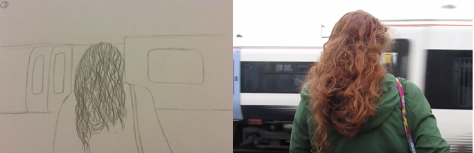
Our opening montage was going to consist of three graphically matched shots, each with the protagonist facing away from the camera, as she gets dressed, walks down the street, and waits at the station.

 The first shot and the third shot are still while the middle shot tracks Bethan as she walks.


This is a Time-lapse- we wanted to use one of the sunset to show the passing of time as the day turns into the night. This represents the last of the Protagonist's innocence.

This is the first shot of the protagonist taking a drug. We decided to break the fourth wall by having her look directly into the camera- symbolising defiance. Up until now the audience hasn't even seen her face.


For these shots, our storyboard is very vague as we intended to film them using a Fish Eye lens. This creates point-of-view shots that are distorted and give the audience insight into how the character is viewing everyone else.


Red lighting is a motif used throughout our Teaser Trailer, representing danger, evil and temptation. A religious interpretation would suggest that the main character has fallen into Hell, due to the high-key lighting in the opening montage contrasting the low-key red lighting and general dark colour palette.


In this shot, the audience can clearly see the protagonists hand putting a drug into her mouth. We wanted to create a shaky, distorting effect that resembled a computer glitch. We cut up the shot and reordered the pieces- signifying the protagonist's inner struggle.

In some shots we decided to add more than simply red lighting- we also used layering. Layering one shot on top of another made the shots more visually creative and gave the audience a glimpse of what it might be like for the protagonist, under the influence of an array of drugs.

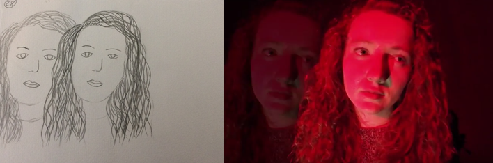
In this shot, we layered the same shot together, but moved it slightly to create the appearance of two protagonists. The idea that she has a split personality is presented throughout and this is suggestive of that. The drugs turn her into a completely different person.

These two shots were filmed with the fish eye lens and are consecutive. The way in which the protagonist perceives others has changed because of the drugs. The point-of-view close up shot of her friend's face under the fish eye lens, appears blurred and distorted and the audience are brought uncomfortably close to both the girl's faces as they converse. The first shot starts off close to Bethan's eye, before she moves away from the camera.


These two shots are repeated twice each very quickly as the protagonist takes a drug. The images flicker from one side of the screen to the other, giving a distorting effect. The multitude of distorting effects used throughout the teaser trailer adhere to the theme of drugs and to the conventions of films about drugs.


We also use close ups of drugs throughout the teaser trailer to contrast the long shots of the party scene.


 In our Teaser Trailer typography is overlapped to create the idea that the film has been given a large number of positive reviews. It also creates the sense of mystery, as we are hiding information from the audience. The typography speeds up as the music does, and builds up to the drop in the music, making it synchronous.
We decided to include shots of blood, both close up and on the protagonist, to depict the physical effects of drugs as well as the psychological and mental.


These two shots are consecutive and show contrasting emotions. We present the lows of drugs as well as the highs, ultimately condemning drugs instead of condoning them due to the detrimental effects.

Due to the portability of the GoPro, we were able to film from the bottom of the bottle as the protagonist drinks. This created a not only distorted, but almost sinister effect. We knew when drawing the storyboard that this was the effect we wanted to create but we were uncertain of how it would turn out.

Our final shot is filmed underwater- the protagonist is physically submerged but also mentally and emotionally submerged in her addiction.


Friday, 11 March 2016

Finished Teaser Trailer and Deconstruction

HARMONIOUS DELIRIUM

The non-diegetic sound of an alarm clock beeping synchronously with the straight cut editing of the opening montage depicts a sense of normality and mundanity. The high-key lighting and the emphasised diegetic sounds of each shot add to this image. Everything is as it should be. 

Until the alarm clock sound effect increases in pace and it soon begins to sound like a heart monitor measuring a quickening heart beat. The distortion of a mundane sound, into one that symbolises panic and danger, highlights how easy it is for someone's life to spiral out of control- even when it was seemingly perfect before. This could be a representation of addiction itself- one may think they have it under control but by the time they realise, it's too late. The use of the reviews at the beginning is to lure the audience in. The contrasts between the black background and the white typography is eye catching and draws the audience's attention. 


Similarly, the alarm clock beeping is a sound people often find tormenting and uncomfortable which further draws their attention to the teaser trailer. The three shots used in the opening montage are examples of graphic matching and don't allow the audience to see the protagonist's face, leaving them wondering who this person is.

The time-lapse is used to present the passing of time, as the protagonist travels to the party. The sun is setting which not only depicts the sky going from light to dark, it depicts the protagonist transforming from good to evil. 
This is emphasised by the use of breaking the fourth wall in the next shot, as Bethan takes a drug, looking directly into the camera. This act of defiance is paired with a non-diegetic pop song remix, to further highlight the distortion the protagonist is experiencing. The lighting has now become low-key and the lights of the party are multi-coloured, adding to the warped, distorted tone. Not only this but the use of a Fish Eye lens makes the point-of-view shots blurred and hazy, giving the audience insight into how one would feel under the influence of drugs. Some of the shots are lit with red lighting, perhaps symbolising danger and evil- addiction is not only dangerous, it can bring out someone's dark side.
Other than red lighting, layering is also used to give the effect of disfigured reality. An extreme close up of the protagonist's eye is layered with a long shot of her spinning around absent-mindedly, portraying the two sides of a person struggling with addiction. One is aware of what they are doing, while the other doesn't realise the consequences of their actions. Drugs provide the protagonist with a sense of both entrapment and escape. The music increases in speed as the intensity of Bethan's addiction worsens. 

The use of the overlapping typography combined with the distorted music and silhouetted shot of Bethan taking one drug too many symbolises utter chaos as the protagonist's addiction goes from bad to worse. The fast paced editing that follows this, emphasises the downfall of the character as she continues to become more and more dependent on the drugs. Close ups of these drugs are used to present their significance on the plot. Bethan uses them as a short-term escape but is ultimately trapped within her addiction. Compared to their dark, low-key lit surroundings, the pills are brightly coloured and evoke a sense of both emancipation and intrigue.

The fast-paced straight cuts are parallel with the sound as they were in the opening montage, to present the drugs have now become a part of the protagonist's daily routine. The cold-tone shot of the protagonist staring into the mirror- looking afraid and puzzled as she slowly wipes her bleeding nose, is preceded by more warm-tone shot of her laughing and once again breaking the fourth wall. 

The contrast of emotions are intended to make the audience feel uncomfortable while also giving them a close up look on the different ways in which one can be affected by addiction. The penultimate shot of the protagonist running, mirrors the tracking shot at the beginning, when Bethan is mundanely walking to the party. The alteration in lighting as well as the increased shakiness of the hand held shot signifies the huge juxtaposition between the start and end of the Teaser Trailer. The music stops momentarily as the screen goes black- leading the audience into a safe sense of security. When you think the addiction may be under control, the serenity is interrupted by the last shot of the protagonist screaming under water. 

The last shot of a teaser trailer should be memorable in order to ensure the audience watch the following trailer and eventually the film and the jump from pitch black to a predominantly white shot as well as the abrupt increase in volume, does this effectively.

Tuesday, 8 March 2016

Using Photoshop

For our poster and some elements of our website we had to use Photoshop. For A2 it is a new, unfamiliar software so we began by experimenting with it.


In this photo we wanted to edit the colouring to make her hair more red and her skin more pale- to represent the power her addiction has over her. The motif of red colouring is used throughout our teaser trailer to represent her addiction and the danger it enforces on to her.

We edited different layers of our poster in order to change the colour of the photo to black and white. By using the lasso tool, we were able to select the areas in which we wanted to bring out the colour- the blood from her nose and her hair. Both are red and fit in with the motif of bright red lighting that is exhibited in our teaser trailer. However we decided that we didn't want to use this style for our poster, as it gives the photograph an animated effect, and we believed it looked rather unprofessional. The black and white element doesn't really fit with the tone of our trailer and from analysing pre-existing movie posters we understood that the more the poster reflects the trailer, the more effective it is.


To create our Poster, we layered photos of the protagonist on to a black background. By editing the opacity of the photo layers, we were able to create a photograph that depicts two of her- one that is looking sideways, creating suspicion while the other looks straight ahead. We matched the photos up so that they shared an eye, representing how intertwined the protagonist and her addiction are. Throughout the Teaser Trailer she is presented as two different people, with and without the drug and these are depicted on the poster. Regarding typography, Photoshop only allowed fonts to be up to a certain size, so we had to select a font in Word, and apply this to the poster afterwards. Luckily Photoshop allowed us to remove the backgrounds of the typography which was necessary when adding the typography. We also used this tool for the title on our website.

Our final poster

At first, we weren't sure which image to use for our poster. We had a couple to choose from but neither of them were exactly what we wanted to use on a poster to represent our film.
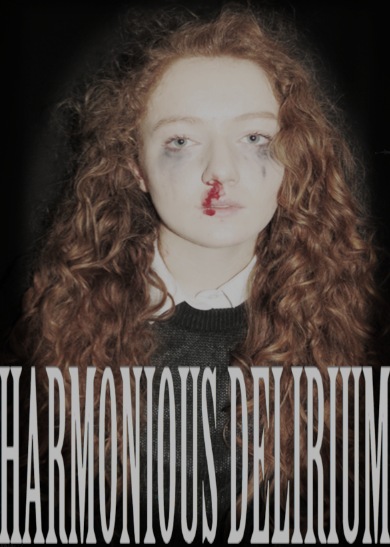
We attempted to make a poster with this image- to see what it would look like after we edited it and added typography. However it didn't have the right tone we wanted to portray through our poster, and the theme of distortion wasn't present.
We next changed the image to one with two photos overlapping-something we do with our shots in our trailer. We matched up Bethan's eyes, which worked quite well. 
We decided that we also needed to change the typography- it was difficult to read and we didn't think it gave the poster the right tone.

This is our final poster.

The genre of our film is psychological thriller, and this is why we used two overlapping images. The photo is the key focus of the poster which is why our typography is minimalistic. Bethan is two people- before and after she takes the drug. The first image depicts her looking sideways- looking for a way out of her addiction. However, the more prominent image is the face of the drug-addict, suggesting no matter how hard the protagonist tries to beat her addiction- she can't win.  While the left image looks calm, and natural- the right face has a nosebleed to show her physical deterioration and mascara smudged under her eyes, to show her emotional deterioration.

The photo is quite dark- with a black background and a reddish/brown tint to the protagonist.  This is why we decided to make our typography white- so it is easily visible and catches the attention of the audience. The font is simplistic to contrast the complexity of the over lapping images, and what they signify. The title separates the tagline, making the words 'Harmonious Delirium' the centre of the audience's attention regarding typography. Although the quotes under the stars are small- the five star ratings are easy to see which will draw the attention of the audience anyway. 

Following the conventions of a typical film poster we have included the credits at the bottom of the poster. These are hard to read but the point of a poster isn't necessarily to promote the actors, director and producers.