Here is our new shot list.


 It was suggested that the beginning section of the trailer did not effectively convey the Psychological Thriller genre, due to the slow pace, continuity, and high-key lighting.
 The opening montage was seen as too similar to a film opening, rather than a teaser trailer, and conveyed aspects of Social Realism, as opposed to Psychological Thriller. Because of this we decided to remove the opening montage, in order to focus more on her drug addiction, and added in drug shots, such as an extreme close up of a syringe, the protagonist drinking alcohol, and pills spilling onto a counter.
 After listening to the feedback we decided to make the trailer more effective we needed to further display the protagonist's descent into addiction and insanity. In order to depict her powerlessness and breakdown, we needed to add more drug fuelled shots, and more shots of her breaking down into madness, such as multiple drug shots.
 One of the main issues that came to our attention was the main drug used during the initial drug taking scene. Feedback from the focus group told us that the drug appeared too unrealistic and unintimidating, therefore to really emphasise the dangers of the drug use we changed this to multiple drugs all falling onto the camera, we did this to highlight how the increase in drug use, within society, as visually they are everywhere, covering the screen completely.
 We were told that a way we could improve our trailer would be to add more creative editing, and camera angles. We achieved this by creating unique shots with the GoPro, this included
 match on action shot of our protagonist drinking alcohol. Additionally, we put the GoPro at the bottom of a full bath and created an ambiguous shot of the protagonist screaming underwater. This follows the conventions of a Psychological Thriller as it adds a sense of mystery. We also expressed creativity through the trailer with graphic matching at the start, before she attends the party. In these shots she is facing away from the camera, getting ready and walking, the repetitiveness of the shots mirror the normality of her life before it is disrupted by drugs.
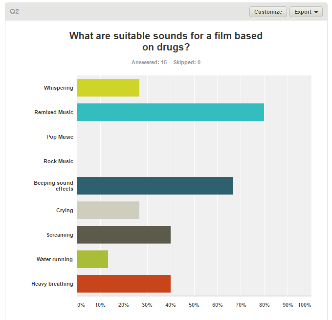
 For question one,we got a brief idea of what our audience expected from a Psychological Thriller, and from this we could see that the majority of responses expected to see drugs, dark lighting and red lighting. We thought it was very interesting too see how our audience saw the significance of lighting for Psychological Thrillers, this could be because of the conventions of most well known Psychological Thrillers, such as Requiem for a Dream, as they often portray the colours red and black, and deal with psychological issues such as drugs. Additionally, this could be because the audience picks up on the dark connotations of darkness and red imagery - therefore as from this survey we became immediately aware of the audience's belief of the importance of lighting - this was a very signifiant and prominent aspect of our trailer.
 Therefore, in order to comply with these, we used low key lighting throughout the more drug-fuelled shots, and used a prominent red colouring for the drug taking scene. This colour use fulfilled the audience's expectations of what a Psychological Thriller should appear like. We had the theme of drugs throughout, with repeated extreme close up shots of various drugs, and a suspenseful drug taking scene.


 This question was asked in order for us to be able to narrow down which colours we focused on within our trailer. The audience's belief of the significance of lighting, and the prominent connotations of red and back is again very evident in this question. This could be because of the common use of this low-key lighting and red and black colour imagery, in modern Psychological Thrillers that our primary audience will be used to watching, such as Se7en, The Machinist and The Silence of the Lambs


 We illustrate the theme of vulnerability through her inability to stop her addiction, she has lost control to it. This is depicted through shots of the physical effects that the drugs have on her, such as nose bleeds, and her spitting out blood. We also convey her lack of control through shots of her screaming and running, to highlight her unhappiness and vulnerability.
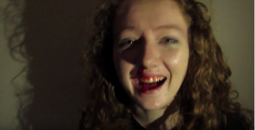


 As we can see the majority of the poster is taken up by the image of the sky, and Amy's eyes in it. Nick Dunne, her husband is placed at the bottom of the image, looking small and vulnerable compared to Amy's huge eyes above him. The poster is predominantly a blue/grey shade, with a white cloud shadowing parts of the title. The film focuses on lies and deceit which is likely why the cloud was placed in the centre. The top of the poster is the darkest- a navy blue- which may represent Amy's dark plans and twisted ways. The figure of Nick has been slightly distorted- the top half of his body moved slightly left. His life has been torn apart by someone he would never have expected. The truth has been distorted like the image.

